
Motion Controls International
Previously known as Mirror Controls International, MCI is a manufacturer of various actuators for the automotive and other industries.

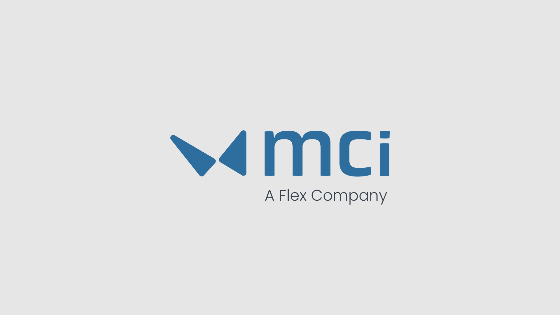
Logo Redesign
With the company changing its name from Mirror Controls International to Motion Controls international, its an appropriate time to modernise the current logo to better fit the new brand.
The current logo has been in use by the company for many years, therefore it is important to not alter it too much as it has become an asset of recognition for the brand.
The inspiration for the new logo comes from butterflies. These creatures are often used to represent transformation, change or new beginnings. Like a butterfly, MCi has transformed from making only mirror actuators to making space based and aerodynamic actuators. Hence ‘Motion Controls’.
The new logo keeps the essence of the old by keeping the actuator graphic but inverting it and adjusting it slightly to more resemble a butterfly.
This new butterfly shape can be used in many applications as a branding element. (see below)


Website Redesign
The current website homepage contains a generic background image and a short descrption of what MCi does.
This doesn’t do much for a potential customer as they may not even read the text or scroll past the image trying to find the relevant information they are looking for.
A picture speaks a thousand words, therefore the homepage redesign incorporates heavy use of imagery of the different applications of its products.
This imagery can allow a potential customer to better visualise what the company is about therefore leading to a better first impression.