
Stodge Face
Is a bakery franchise based in the midlands with stores in Athlone, Galway and Tullamore. Created by its owners Nigel and Morgan, the two combined their love of baking and brought the taste of American bakeries across the pond to Ireland.
Project Brief
Establish clear brand guidelines.
Revise logo.
Refine colour palette to ensure consistency on all mediums.
Create new packaging design.


Brand Guidelines
Upon reviewing the original brand guide that was given to the client, it was evident that the guide lacked polish.
Lack of colour codes.
Logo only given as a .png.
Unlicensed fonts.
No guides explaining how to use assets.
Lack of brand slogan.
Multiple meetings were had with the client to revise the errors, and to explore and establish a brand identity that they would be happy with, but also one that would effectively speak to their target audience.
Logo Revision
The logo was only given as a 500x500px .png file. Therefore the logo had to be recreated in Illustrator as a vector so it could be scaled for different mediums.
Recreated the logo on Illustrator as a vector so it could be scaled to any size.
Adjusted the spacing between the icon and ‘Stodge Face’ text for better balance.
Added a stroke to the bottom of the cupcake to increase visual literacy of the cupcake - some people struggled to see it as a cupcake beforehand.
Created a mini version of the logo to be used on thumbnails, favicons etc.


Font Selection
The original brand fonts required commercial licenses which the client was not aware of.
Two new fonts were selected that did not require a paid license.
‘Montserrat’ was chosen as the primary font due to the high number of weight options and its modern subtle look.
‘Good Vibes’ was chosen as the secondary font as it was similar to the previous script font and complimented and contrasted the more bold primary font.
Brand Slogan
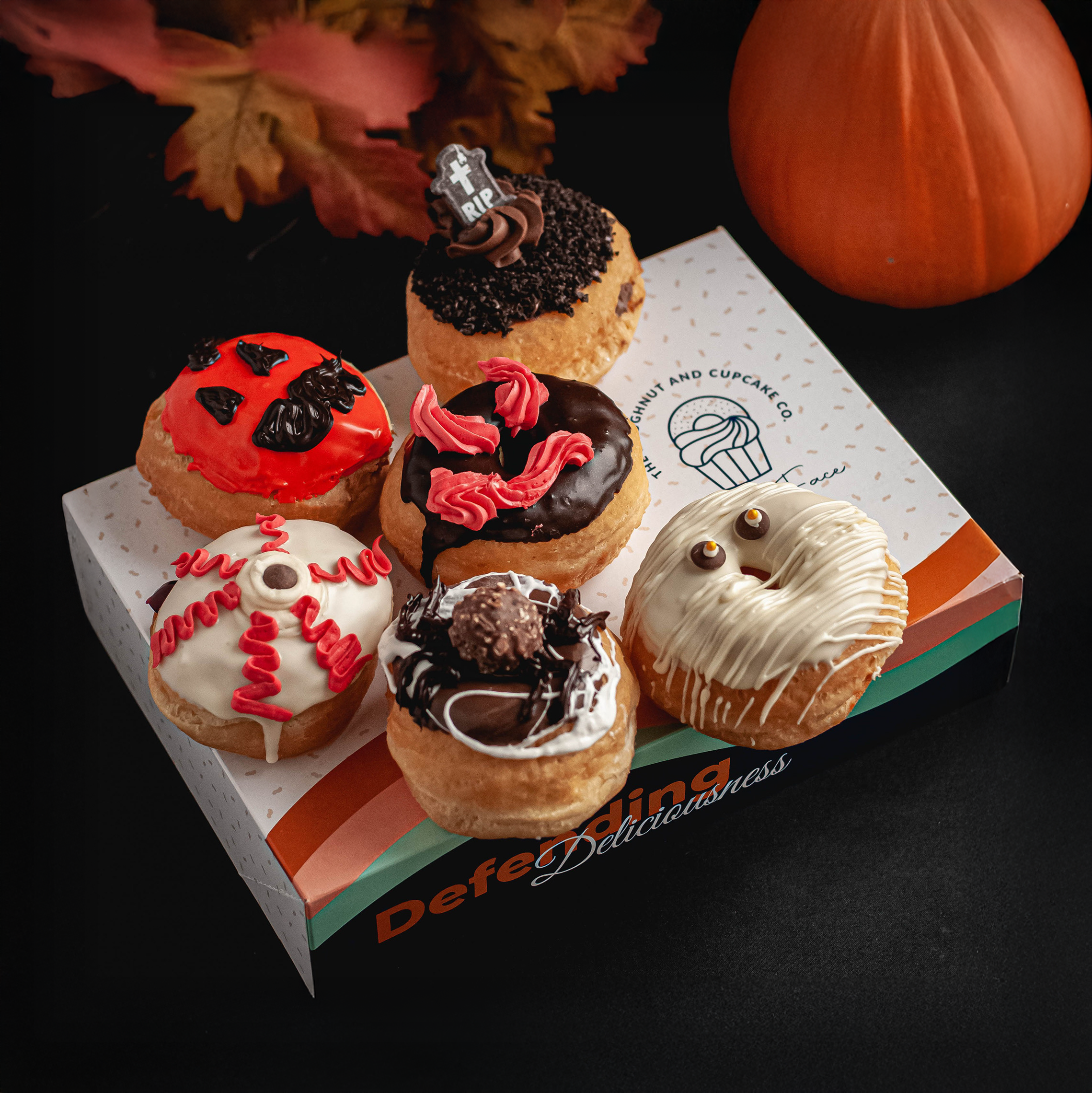
The client had a selection of taglines that they used sparingly throughout their brand. We came to the conclusion of using ‘Defending Deliciousness’ as the main brand slogan.
Defending Deliciousness was chosen as it fit best with the brand voice & style and the predominently younger customer base and target audience.
This slogan would be put on the front of the donut packaging to further differentiate Stodge Face among other bakeries.

Brand Pattern
The old logo had small dots on the donut to signify sprinkles. I proposed these dots were to be made into vectors and turned into an ‘S’ shape and then used on various branding elements such as the packaging and business cards etc. (see below)
The client loved this idea as it adds a nice level of texture to an otherwise empty background.

Colour Palette
The colours provided in the original brand guidelines worked fine in digital mediums. However, due to the differences in CMYK & RGB, when printed the colours did not match.
After some test prints a new palette was chosen that closely matched the existing colours but worked well in print and digital.
The original palette only consisted of Orange, & Navy (no colour codes were provided) and so, some complimentary secondary colours were added to the palette.
Codes for all the new brand colours were provided to ensure consistency.
Brandy Punch
Pantone: 145 C
RGB: 207 127 0
CMYK: 0 49 100 8
HEX: CF7F00
Blue Zodiac
Pantone: 281 C
RGB: 0 32 91
CMYK: 100 78 0 57
HEX: 00205B
Tickle Me Pink
Pantone: 1471 C
RGB: 0 32 91
CMYK: 100 78 0 57
HEX: 00205B
Aqua Island
Pantone: 337 C
RGB: 143 214 189
CMYK: 40 0 29 0
HEX: 8FD6BD
Neutral Black
Pantone: Neutral Black C
RGB: 34 34 34
CMYK: 72 66 64 72
HEX: 222222
White
Pantone: N/A
RGB: 255 255 255
CMYK: 0 0 0 0
HEX: FFFFFF
Packaging Design
Once the colours and other elements of the brand were finalised the donut box design could be created.
The design was more vibrant than other competitors which helped potential new customers identify the brand.


